I work in a team that is responsible for Software-Ergonomics, Usability, and Accessibility.
Today I talked to a colleague of mine (a senior UX designer) about VulnDetect and we had some new ideas for a improved design for the List of Application.
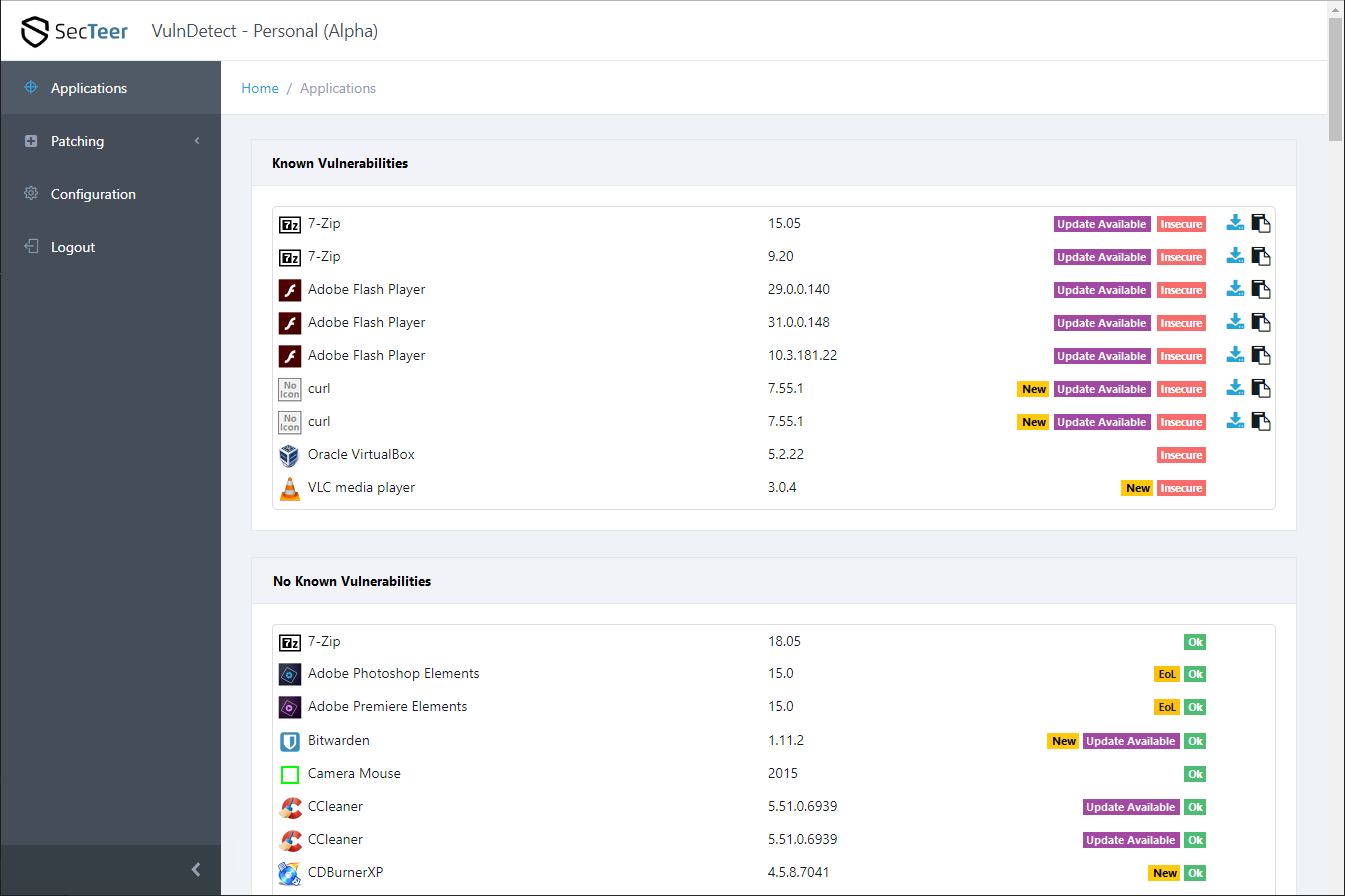
Here is a draft of the new design:

Click the image to enlarge it
Each application has a specific purpose and the UI must support the user performing his work-task.
The main goal of VulnDetect is to tell the user wich applications have known vulnerabilities and if there are updates for these vulnerabilities available.
To provide these information quickly and in a clear design, we split up the list of application is several groups:
- Known Vulnerabilities
- Unknown (not shown in the draft)
- No Known Vulnerabilities
This way users see at once the vulnerable apps (that require immediate action).
Applications that have no known vulnerabilities are in a separate list (no immediate actions required).
At each application there should also be a label Update Available if there is an update available for this application.
See also Additional Status for Update Available.
So users see at once what patches must be installed ASAP.
After performing a system scan, VulnDetect should mark all applications with the label "New" if:
- There is a new update available
- There is a new vulnerability detected for this app
- The application is new in the list of applications (then the label should be shown behind the application name)
- The user installed a new version of the application (then the label should be shown behind the version number)
See also Show Changes over time in the List of Apps.
The label "New" should have a yellow color, so for the label EoL you should select an other color.
You see that the new layout not only increases the usability and the user experience.
It also implements two other suggestions (see links above).
I hope you all like the idea of the new UI and I hope it is implemented soon.
If you like the new UI, please upvote it.


